
You spend hours perfecting your virtual item, only for it to get lost in the vast Roblox marketplace. It’s frustrating, right? You might think the problem is with the item itself.
But here’s the truth: on a visually-driven platform, roblox marketplace images are more important than the item’s features for getting that first crucial click.
This article is here to help. I’ll guide you through creating compelling visuals that grab attention and drive sales. From icon design to 3D previews, you’ll learn the specific techniques top creators use.
By the end, you’ll have a clear, actionable plan to make your items stand out.
First Impressions Matter: The Science of a Clickable Marketplace Icon
When you’re scrolling through the Roblox marketplace, what catches your eye? It’s not just about pretty pictures, and it’s about making a split-second decision.
That’s where the “three-second rule” comes in. If your icon doesn’t grab a user’s attention in those first few seconds, they’ll move on.
The Anatomy of a Perfect Icon
A perfect icon has three key elements: a clean, high-contrast background, a clear and recognizable silhouette, and dynamic lighting. Let’s break it down.
First, the background, and it needs to be simple and high-contrast. Think about it like this: if your background is too busy, the item gets lost.
I once heard a designer say, “Your background should be a stage, not a distraction.”
Next, the silhouette, and it’s got to be instantly recognizable. Imagine you’re looking at a tiny thumbnail.
Can you tell what the item is? If not, it’s time to go back to the drawing board.
Finally, dynamic lighting, and this is where the magic happens. Good lighting highlights the shape and texture of your item.
It makes it look real and inviting. A friend of mine, who’s a seasoned designer, put it this way: “Lighting is the difference between a flat image and something that pops off the screen.”
Color Theory in the Roblox Aesthetic
Color is everything. In the Roblox marketplace, vibrant, complementary color schemes are your best bet. They stand out and catch the eye.
But here’s the trick: make sure the colors complement each other and the overall UI. You don’t want your icon to clash with the marketplace’s design.
Technical Specifications for Icons
Now, let’s talk about the nitty-gritty, and your icon should be 512×512 pixels. This ensures it looks sharp on all devices and prevents any pesky pixelation.
But don’t just take my word for it. Test your icon by shrinking it down to the size it will appear on the search page. Is it still legible?
Does it still have the impact you want? If not, it’s time to tweak.
The Goal of the Icon
Remember, the goal of your icon isn’t just to show the item. It’s to sell the idea of the item. You want to entice a click.
Make the user curious, and make them wonder, “What’s that? I need to know more.”
So, next time you’re designing an icon, think about those three seconds. Make them count.
Beyond the Thumbnail: Mastering 3D Previews and In-Context Shots
Let me tell you a story. I once uploaded a cool hat to the Roblox Marketplace. The thumbnail was great, but the 3D preview?
Not so much. Sales were slow, and I couldn’t figure out why.
The 3D preview is where the user decides to buy. It’s the moment of truth. If it’s not up to par, you lose them.
Period.
CAPS: A clean, well-lit 3D preview environment is CRUCIAL.
You want the user to rotate and inspect the item from all angles without distractions. Think of it like a high-end store display. Everything should be perfect.
Setting up a ‘dummy’ character or mannequin in Roblox Studio isn’t hard. Just create a standard avatar and equip your item. This shows how it fits on a typical player.
Supplementary visuals are a game-changer. Short GIFs or additional images showing the item in an actual game environment or during common animations (like running or jumping) can make a huge difference.
Special features, such as particle effects, textures, or animations, should be highlighted. If your item has glowing parts or special movements, show them off in the preview or supporting media.
One common mistake is having the item clip through the avatar’s body in the preview. This signals low quality and can turn buyers away. Make sure everything fits perfectly.

Remember, the 3D preview is your chance to seal the deal. Make it count.
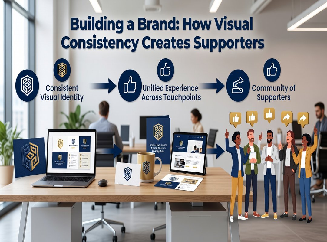
Building a Brand: How Visual Consistency Creates Super-Fans
When you think about your store on the Roblox marketplace, do you have a clear visual style in mind? It’s more than just making things look pretty. A consistent visual brand can make your entire catalog instantly recognizable.
Think about it. If you always use a specific lighting style, background color, or icon border, users will start to associate those elements with your creations. For example, a creator who always uses a neon glow for their sci-fi items or another who sticks to a clean, minimalist grey background for all their clothing.
This consistency builds trust. When someone likes one of your items, they’re more likely to explore your other offerings. They know what to expect and feel a connection to your style.
A strong visual brand turns one-time buyers into repeat customers and followers who actively seek out your new releases. It’s like having a loyal fan base that’s always ready for more.
So, here’s a simple action item: create a basic template or set of rules for all future marketplace visuals. This could be as simple as a specific color palette, a preferred lighting setup, or a consistent icon border. Stick to these rules, and watch your brand grow.

If you need more tips and strategies, check out Havajazon. They offer great insights and tools to help you build and maintain a strong visual brand.
Top 5 Visual Mistakes That Are Killing Your Sales
Mistake 1: Blurry or Low-Resolution Images
Blurry images make you look unprofessional. Use high-resolution photos to show your products clearly.
Mistake 2: Misleading Thumbnails
Thumbnails that don’t match the actual product lead to disappointed customers and a bad reputation. Make sure your thumbnails are accurate and honest.
Mistake 3: Cluttered Backgrounds
A cluttered background distracts from your product. Keep it simple so your item stands out.
Mistake 4: Poor or Flat Lighting
Bad lighting can make even the best 3D model look cheap. Use good, natural lighting to highlight your product’s features.
Mistake 5: Inconsistent Art Style
Mixing different art styles makes your store look disorganized. Stick to a consistent style for a professional and trustworthy appearance.
Pro Tip: Regularly audit your listings with this checklist to keep your visuals top-notch.
Turning Views into Robux: Your Visual Action Plan
Superior visuals are a creator’s single most powerful tool for converting marketplace scrollers into buyers. Mastering icons, 3D previews, and brand consistency is a learnable skill that directly impacts earnings.
Roblox marketplace images can make or break your sales.
Take the challenge today: pick one of your underperforming items and apply these visual principles. This effort is the critical final step in turning your creative passion into a successful venture on the platform.